The Nature of Things: “Making Space” at The Works

Agata Garbowska, Curatorial Assistant

image

As the Curatorial Assistant with The Works Art & Design Festival, I have had the opportunity to read the proposals and statements of various artists exhibiting during the 2015 festival. While reading statements written by exhibiting artists, I noticed that several artists are addressing the theme, “Making Space,” by creating work that references the landscape. For example, both Lynette de Montreuil and Paddy Lamb are in some ways using material found in the landscape to address the theme “Making Space.”

As one of The Works’ artist-in-residence on Churchill Square during the Festival, Lynette de Montreuil will use organic material from the Edmonton landscape to create an architectural element on site. Titled Cradle to Cradle, the piece will begin to degrade during the Festival and, as de Montreuil writes in her proposal, “showcase the fleeting nature of all things.” De Montreuil elaborates that in allowing the organic material to decay, the artist is giving the material agency. De Montreuil will be building Cradle to Cradle over the first few days of the Festival, but those who want to see more of her work before festival begins should visit her website: http://lynettedemontreuil.ca/

Paddy Lamb will be exhibiting work in City Hall in a show titled New Requiem for the Field. Recently, Lamb has been examining an abandoned quarter section of farmland east of Edmonton. The artist has been collecting source material from the site and bringing the material from the site into the studio. To quote Lamb’s artist statement: “by inhabiting this space; documenting, dismantling and reusing discarded objects and machinery, [the artist] is trying to build a picture of a particular place and the shifting balance between man and nature within a specific environment.” Those interested in seeing more of Paddy’s work before the Festival can visit his website: http://paddylamb.com/

To preview more of the art that will be showcased at The Works Art & Design Festival in its 30th year, and to explore how other artists address the theme “Making Space,” download the Festival Guide at http://www.theworks.ab.ca/.

Dawn Marie Marchand at The Works: a place to hang your stories

By Cassandra Northrup, Marketing Assistant

image

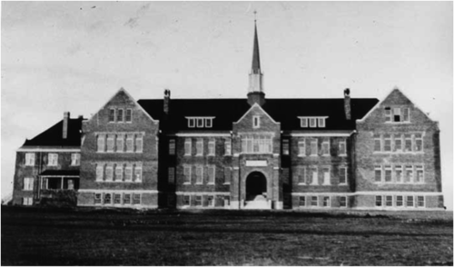
Details: Photograph of St. Paul’s Residential School in Cardston, Alberta

This year The Works Art & Design Festival is displaying 51 exhibits. One of the exhibits that I am especially interested in is an installation by Dawn Marie Marchand titled a place to hang your stories.

Marchand’s installation is an extension of the Truth and Reconciliation Commission. She is offering an opportunity for those affected by Alberta’s Indian Residential Schools to have their voices heard. As you walk through the installation, you see paper tiles all along the walls that hold the stories and experiences of survivors and family of survivors of the Residential Schools. There is an area of Marchand’s installation where a child sized desk is set up. This desk is meant to represent just how small the Aboriginal children were when they were taken from their homes and sent to the schools. There is also a section of the installation that has a blackboard for those who have experienced Marchand’s work to be able to express how it makes them feel or to write about their own stories related to the Residential Schools. With her installation, Marchand is aiming to raise awareness about the systemic oppression that occurred for hundreds of years and plays such a big part in Canada’s history. She is hoping that her installation will provide a kind of healing for those who have been directly or indirectly impacted by the Residential Schools.

I know that Marchand’s installation will be sure to get people talking, so I am interested to see what sort of impact will take place on the patrons who visit her installation. 

Marchand’s installation can be found in the Big Tent on Churchill Square. Find out more here: http://www.theworks.ab.ca/festival-exhibits/

The Works Training in Art (TART) Program

By Emily MacDonald, Curatorial Coordinator

image

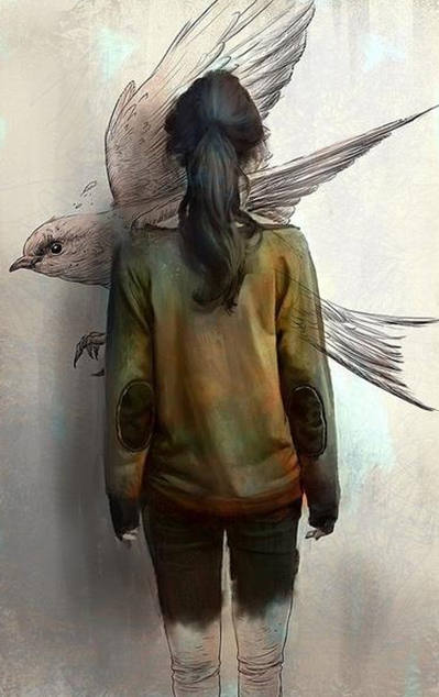
Image taken from http://ville-noire.com/

Contemporary art has more market value in the 21st Century than ever before thanks to online sales and art auctions. In this highly commercialized art world, the commodification of art intensifies, threatening to compromise the social and cultural agency of the works.  A public art festival, however, has the potential to work against this trend by engaging the community, and thereby restoring art’s social, political, and cultural agency.

The Works Art & Design Festival bridges the gap between the public and art and with the development of the festival’s TART: Training in Art leadership program, this gap is closing. Rather than a focus on information dissemination or docent-public relationship, the TART education model trains volunteers to lead the public to be active participants in meaning creation.

In the 1980s, American artist Martha Rosler observed that  the  public was being replaced by audiences. Fellow artist, Anton Vidokle, illustrates Rosler’s distinction between audiences and the public by asking us to imagine a movie theatre. In the theatre, according to Vidokle, audiences sit passively absorbing content, rather than other situations where the public is encouraged to participate in a more active way. In other words, “[a]udiences are groups of consumers of leisure  and  spectacle; they have no political agency and no necessary means or particular interest in affecting social change.  My  feeling  is  that  what  Rosler  observed  in  the  80’s  is  now  a  fait  accompli:  the   audiences for art have become enormous, but there is no public among them”  (Vidokle, 2009).

The public is an important element that contributes to the cultural, social, and political energy of art. This value can sometimes be overlooked when our cultural institutions cater to niche audiences of contemporary art. The publics are sometimes left with an intimidating experiences of contemporary works and this is often the struggle with many public art projects. I often encounter those who are frustrated with these projects because they feel that there is inevitably always a concealed meaning behind the work that is inaccessible. A major barrier to art interpretation is that we tend to see works as a veil. Whether there is anything behind a veil or not, it creates the assumption that there is hidden or concealed content that we cannot access.

Although the TART program has a heavy emphasis on facilitating dialogue and meaning creation, volunteers also learn technical aspects concerning form and composition. This is an amazing experience for any volunteer with an invested interest in The Works Festival. It is an opportunity for growth, to develop as a leader, and to be mediators between art and the public showing people how to come to conclusions on their own rather than pulling back the veil.

Find out how to volunteer for The Festival here: http://www.theworks.ab.ca/volunteer/

Text Crutch: Kelsey Fraser

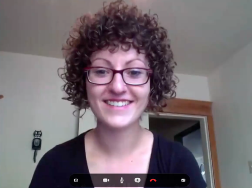
A Skype interview with Kelsey Fraser, who will be showing work at Text Crutch, curated by Robert Harpin. The show will run from October 26 - November 2, 2013 at The Works Gallery at Jackson Power (9744 60 Ave). The opening reception will be held on October 25th, 7 - 10pm. 

What are your influences?

I am influenced by awkward moments, both moments I’ve had personally and moments I’ve witnessed—like the quirks of humanity, the quirks of each individual. And I’m influenced by country music lyrics. As far as artists go, I’m influenced by Ian Stevenson, Mira Calman, and David Shrigley.

I don’t know if they approach it that way, but I view [their work] as a very child-like sense of exploration. They all have an innocent way of viewing the world, which is often times very funny—commenting on our insecurities in a way that’s amusing.

How do you incorporate text into your work?

It’s kind of a new thing for me. In my last year at ACAD I started using text in my work and I was hesitant to begin using it because I was unsure how text would influence how a viewer viewed my work. I guess I use it very sparingly. By just giving a little hint to the viewer or a little sentence that they can then read in their mind or out loud—however they choose to view the work. They kind of become part of the work through their own inner monologue, I guess.

Many of your works are really funny. How do you use text for comedic effect?

Again, I go back to the notion of childhood with ideas of play and exploration with language. Some words are really funny, just on their own or if you break them up or if you space them slightly differently or play them back-and-forth with an image. I really love creating little sentences or declarations in my work that I feel the viewer will then become implicated in—whether they want to be or not—by basically reading what I’ve written. It kind of puts them into this situation—whether they want to be there or not… my work [tries] to incorporate the inner voice of the viewer.

I don’t’ really know how it’s viewed, but whether you write something large or small or the font you use it creates its own little character. And it can be more child-like or more aggressive or meek in how you write something. For me, when it comes to that, I might not consciously think about the style I’m writing in. But I do consciously think about how large or small I write something, depending how I want it to be viewed. I guess it’s more about the spacing, for me. And how it’s situated in the room, where it is on the wall, and if there’s a conversation happening between different text pieces. When I view other text-based work, sometimes I do think about how the actual word was written and imagine myself writing that word.

I did a piece once where I filmed myself writing. I just had a camera in one hand, and I was writing with the other hand. And it was really not very well filmed, obviously—in an out of focus because it was on autofocus. And I didn’t realize really what I was doing at the time. But it became very funny, after looking back at it to see where I would pause. I would pause when I didn’t know how to spell a word. That was pretty humorous because I don’t know how to spell many words. Or if you choose to punctuate something or how hard you choose to press down on the paper can really bring home a point.

[I used the video] for a presentation in my fourth year, where we had to give an artist talk. I introduced different subjects with the video… I would like to come back to that. It kind of overshadowed everything else I did in my artist talk. These short video clips took on a funny life of their own. They became a piece of their own.

How do you interpret the title Text Crutch?

As far as using text as a crutch in your work—that’s cool if you do. It’s all up to the viewer to interpret it. If you need words to help your work along—like a little pick-me-up—then go for it! I don’t think there’s anything wrong with that. I guess I enjoy work that takes a little bit more to decipher. I guess I like to invest a little more time in it, and if I feel like it’s just one-dimensional, I’ll move on quicker. I don’t know if I’ve experienced much art that’s used text in that way. Usually I find text adds another element to the work. Just another layer. 

Kelsey Fraser has a BFA in Drawing from the Alberta College of Art and Design. 

This interview is brought to you by TickTalk at The Works.
Christine FrostComment
Text Crutch: Jennifer Konanz

image

A Skype interview with Jennifer Konanz, who will be showing work at Text Crutch, curated by Robert Harpin. The show will run from October 26 - November 2, 2013 at The Works Gallery at Jackson Power (9744 60 Ave). The opening reception will be held on October 25th, 7 - 10pm. 

How do you incorporate text in your work?

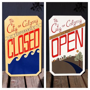
I’m getting into sign painting. So, I’m not concentrating as much on art pieces as much as learning how to sign paint and using text in that way. So, that’s sort of a new way for me of incorporating text. It almost feels like I treat it as an image because you’re making these words really sort of come to life and have their own presence. A lot of times there are few words too. So it almost feels like the words are more becoming images now with the sign painting.

Do you consider the signs works of graphic design or art?

I think the handcrafted quality of it makes it start to feel along the lines of the artistic. In terms of concept, like if you’re making a sign for a specific purpose, you can’t make them ironic or things get confusing—obviously. But I mean in terms of the aesthetic, I think there’s lots of opportunity to play with that.  And that, I think, crosses into the artistic realm. With so much stuff being digital and done on the computer, I think that branch of design is clearly establishing itself as separate from what art is trying to do. But the old graphic design and the old way of doing things was more like working with your hands or painting or making stencils and stuff. That feels more like a cross between the art and design worlds.

 So you think the divide between graphic design and art has widened due to technological advancements?

I think that the process of working through visual problems has become a little different: it tends to be a lot faster. So, attention to certain things has changed because you’re building words and you’re building images so quickly and you’re able to go back and forth, and just make such quick decisions. It depends on how you approach it because the computer is just a tool—like everything else—I think it can be just as artistic. But I think there’s a large amount of people who are maybe not treating it that way. I see a lot of good stuff and see a lot of ways, I think, where the computer is over-relied on, which I think kills a little bit of that artistic aspect to it, in my opinion.

How is working with text different than using other design elements?

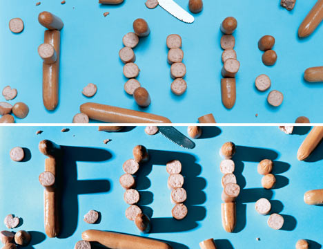
I think because of the obvious meaning attached to words, I think it’s a bit more [difficult to use]. When you’re using it in an ambiguous way or in a more creative way or artistic way, I think it’s even more difficult to use. Maybe that’s why I didn’t use it for the longest time, until graphic design made it safer for me to use. I played with it more, and then I was like, okay, I kind of know how to break it apart and treat it so that it’s not so literal. I think it can become really literal, which is what makes it really hard to get away from … Someone I really appreciate, again talking about using text as images, is the designer Stefan Sagmeister, where he actually takes words and makes them out of objects and photographs them. They’re text but they’re images, but then you also read them as objects. So that’s an interesting way to break the text apart. The meaning behind it that you’d obviously come to starts to break down and that’s where I think some really interesting things start to happen. So, I’d like to make more stuff like that.

What sign will you be showing at Text Crutch?

The one I’m planning for The Works is playing off the function of a sign being very obvious. So, I think it really works with how I’d like to work with text. Sometimes I have to be very literal with it. Obviously, when I’m making signs for a purpose—it has to communicate what it does. But this is sort of a fun opportunity, where I get to be a bit more ambiguous with it.

image

Handcrafted signs by Jennifer Konanz. 

image

From Having Guts Always Works out for me, Stefan Sagmeister

Christine FrostComment